BUILDING BON CHARGE CREATIVE DIRECTOR · ONGOING
↑
40 TO 65% YOY GROWTH CONSISTENTLY SINCE REBRAND
Bon Charge is a science-backed wellness tech brand built for high performers. I joined to lead a full rebrand and have stayed to build everything since: identity, campaigns, digital, product, packaging, retail, OOH and events.
This is not a case study with a start and end date. It is a living brand and I am actively building it.
BRAND STRATEGY • VISUAL IDENTITY • TONE OF VOICE • CAMPAIGNS • OOH • PACKAGING • WEBSITE • EVENTS
The Brief
A Brand Built to Earn Its Place in the Conversation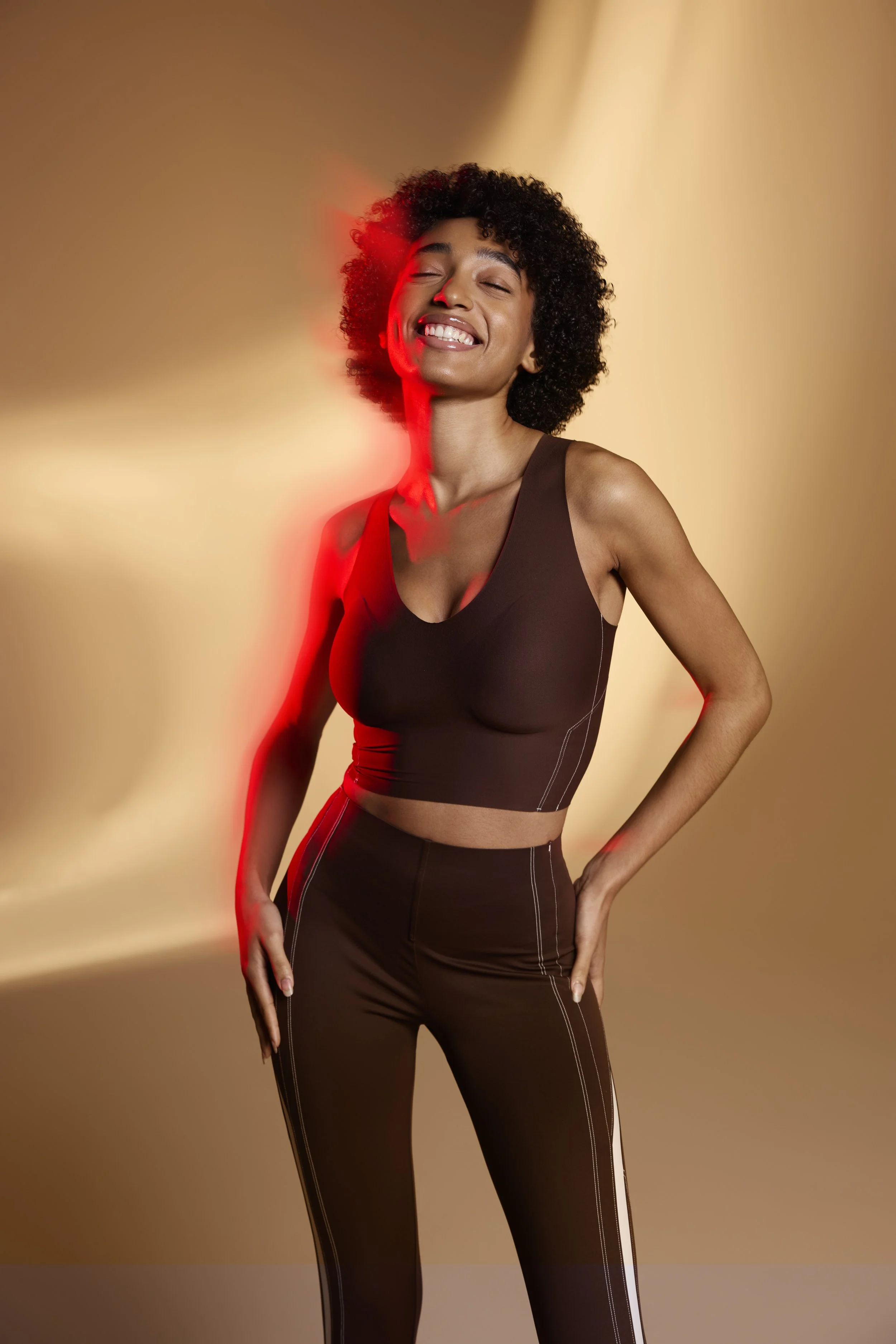
Bon Charge came to me with strong product conviction and a visual identity that hadn't caught up with its ambition. The rebrand wasn't a cosmetic exercise. It was a ground-up repositioning: what the brand stands for, who it speaks to, how it sounds, and what it looks like across every surface.
We landed on science-backed wellness tech for high performers. People who take their sleep, their recovery, and their light environment seriously. The visual language had to match that seriousness while staying warm, considered and human.
Since the rebrand the brand has grown 40 to 65% year on year, consistently.
65%PEAK YOY GROWTH SINCE REBRAND
FULLEND-TO-END CREATIVE OWNERSHIP ACROSS EVERY TOUCHPOINT
NOWACTIVELY BUILDING
THE BRAND TODAY
"Most rebrands are a moment. I wanted this one to be a system. Something that gets better and more coherent the longer it runs."
MARCO NIEFER · CREATIVE DIRECTOR, BON CHARGE
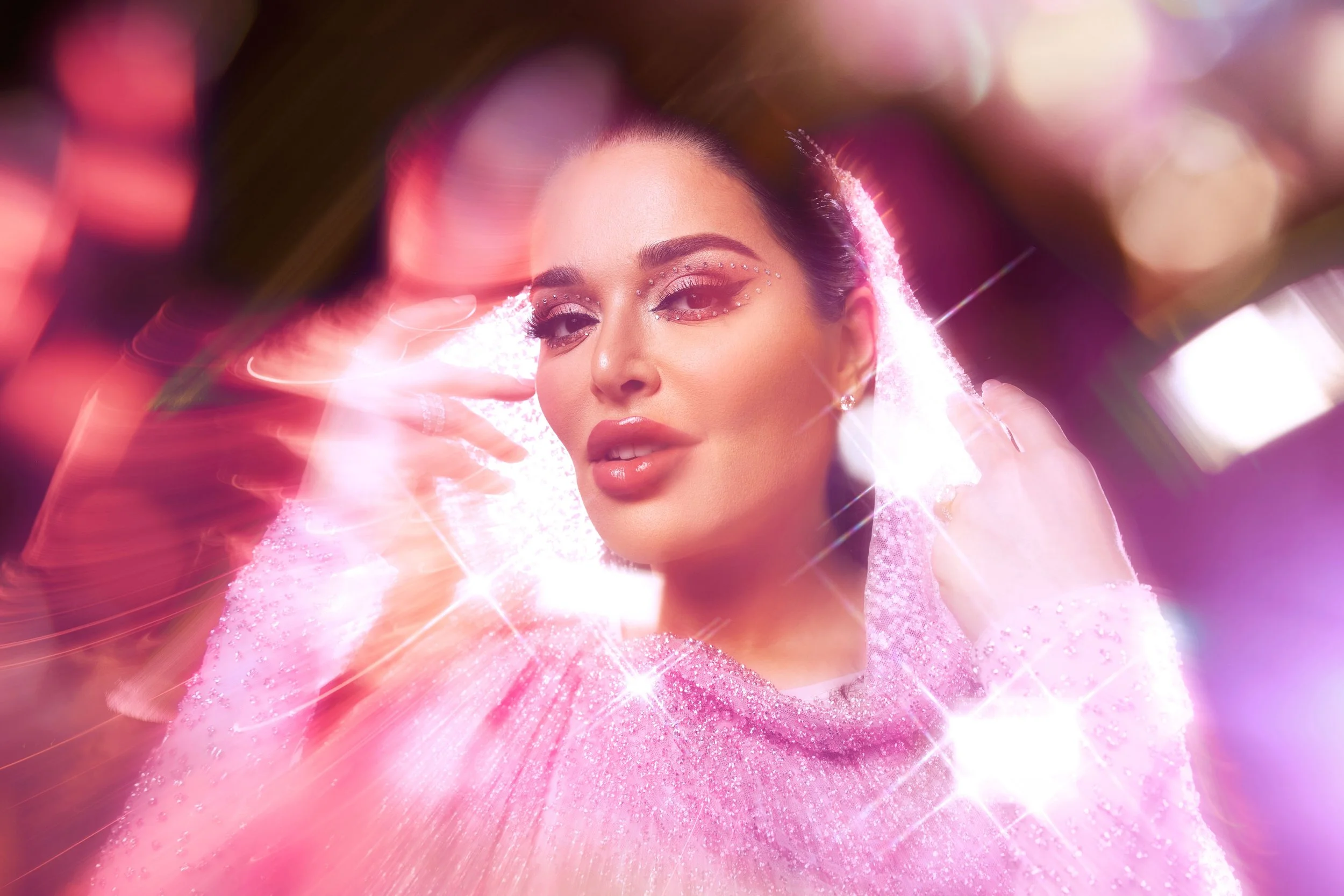
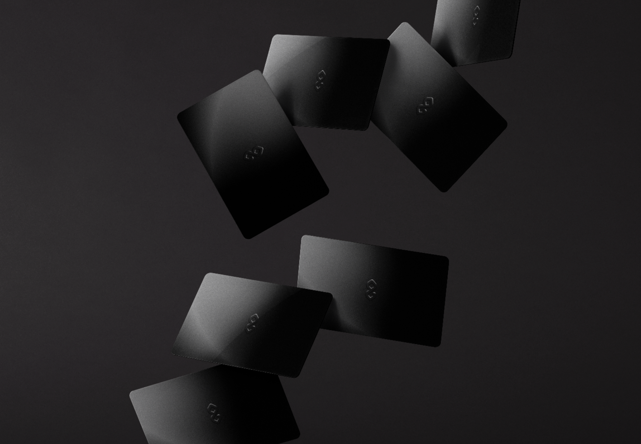
Instrument Sans.
Instrument Serif.
Soft linen tones.
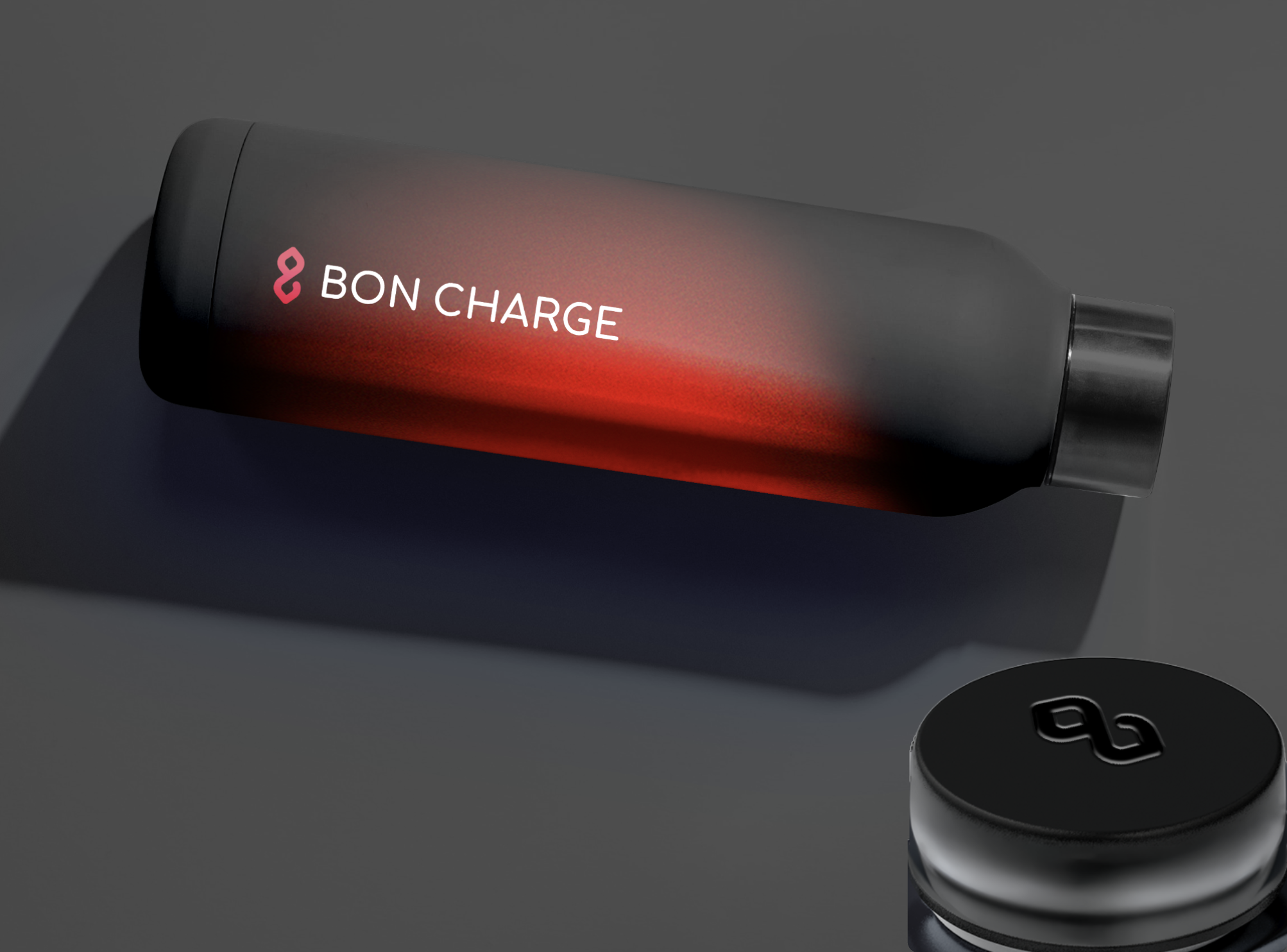
Red light flares.The current identity pairs Instrument Sans and Instrument Serif for a refined, editorial feel that sits between clinical precision and human warmth. Soft beiges and linen tones form the foundation. The red light flares and gradients are the brand's signature energy: they are not decorative. They are the product. Light as the medium, light as the aesthetic.
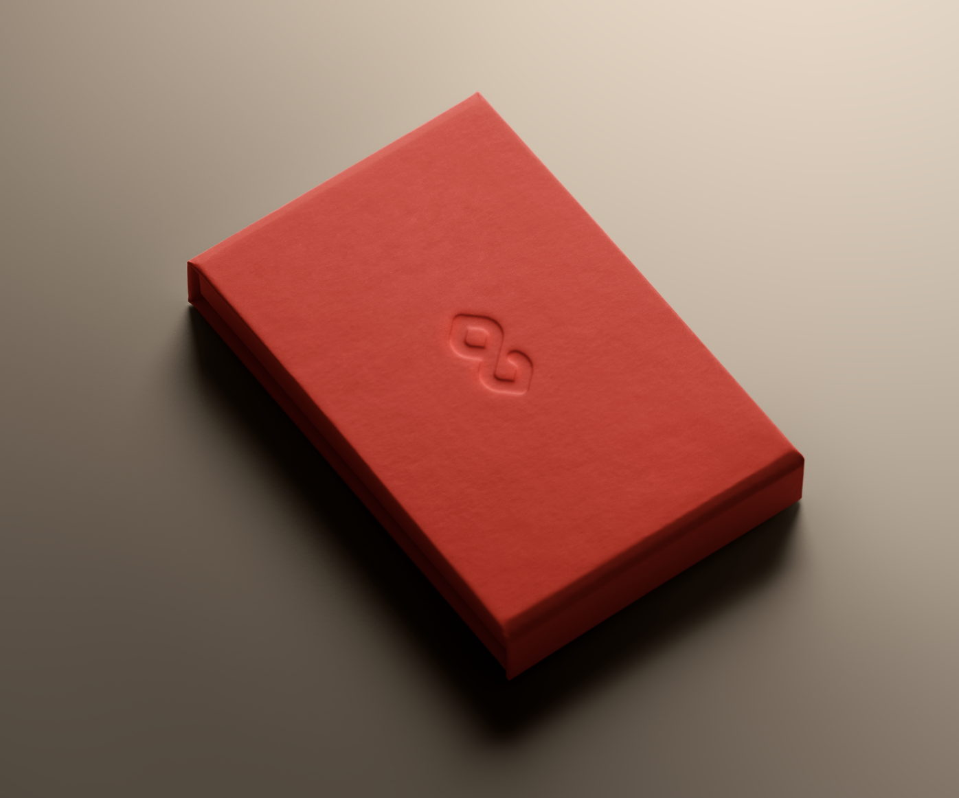
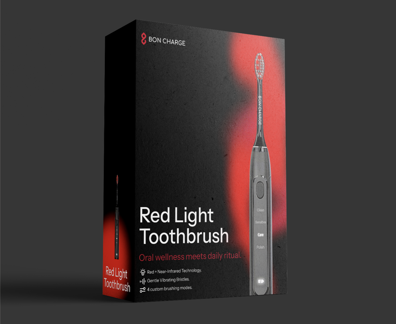
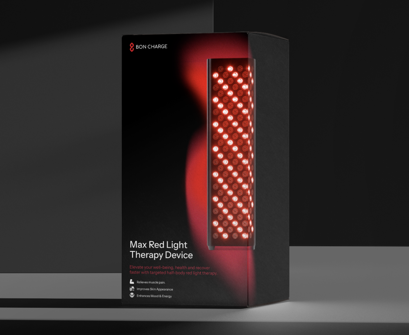
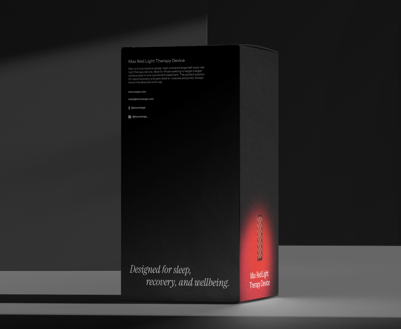
Packaging
The product
in your hands
before you open it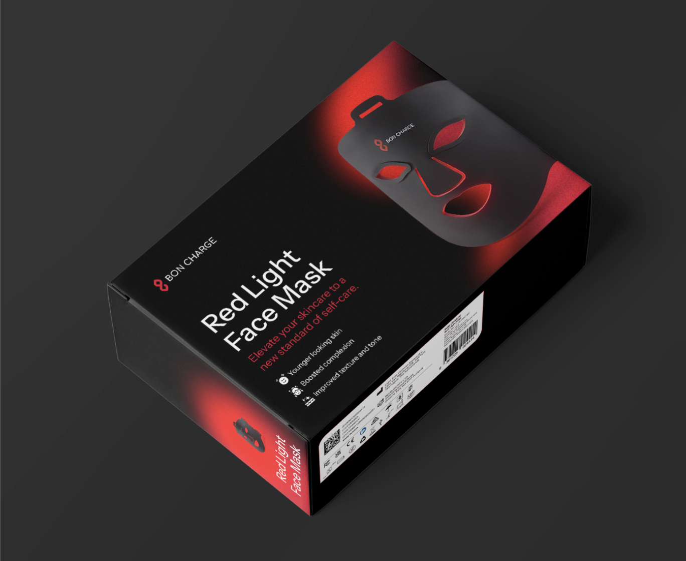
I directed the full packaging design system for Bon Charge: outer boxes, inner trays, inserts, recovery bags, tote bags, and branded merchandise including apparel and socks. Every surface is a brand moment.
The packaging system uses the the deep onyx and scarlet palette that had brand equity with a refreshed look with red light gradient details applied selectively. When a customer opens a Bon Charge product, the brand experience doesn't start at the website. It starts in their hands.
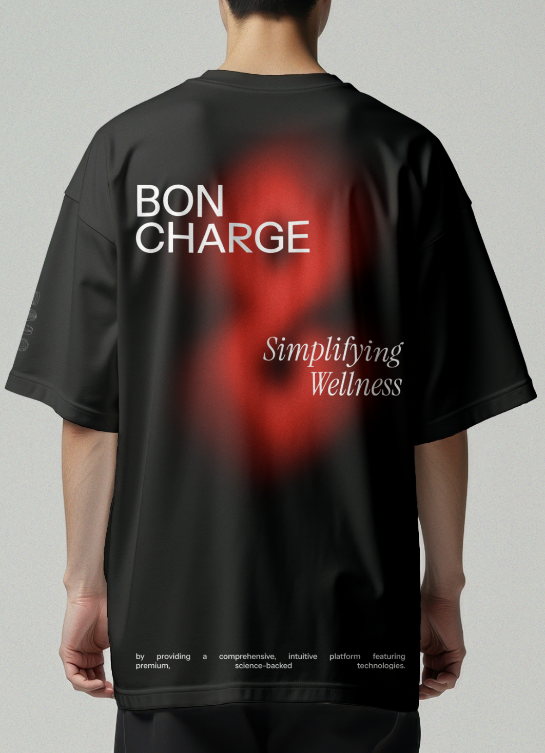
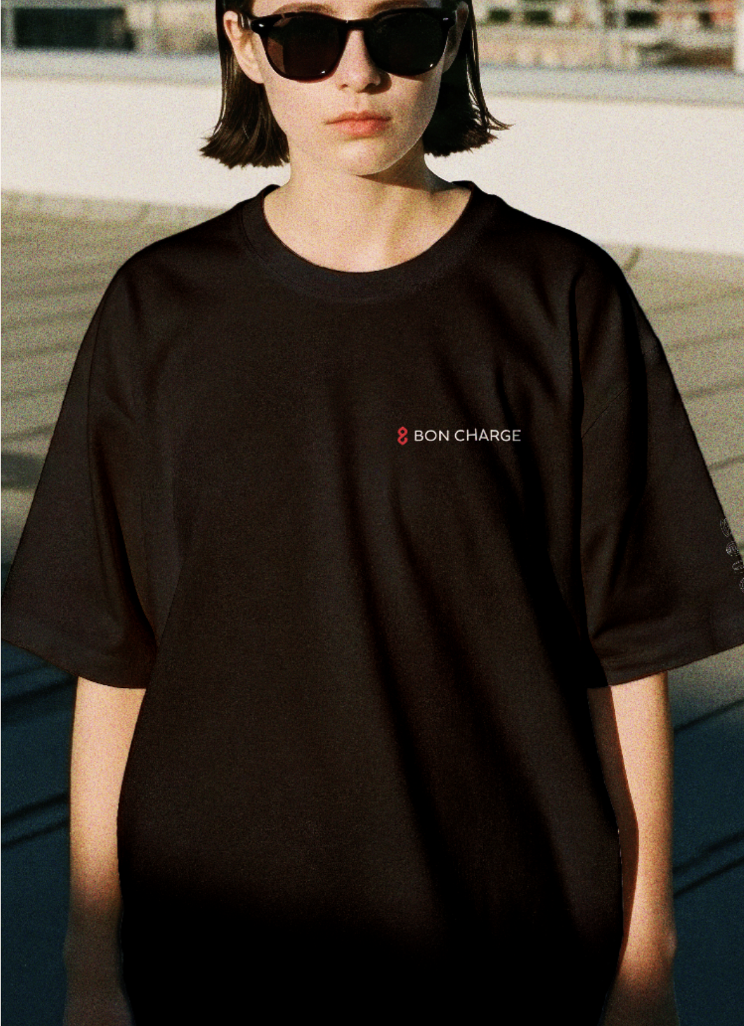
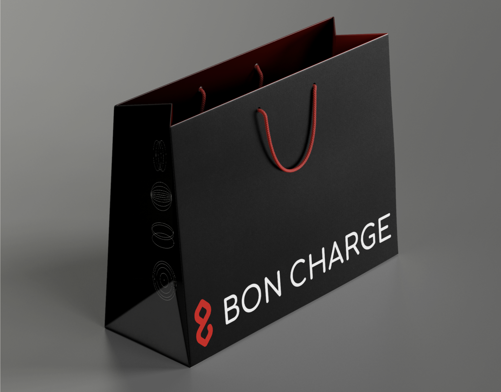
Brand World · Merch and Lifestyle
A Brand You
Can Wear
The Bon Charge brand world extends beyond product into lifestyle. I directed the full merch range: t-shirts, tote bags, recovery bags, and socks, all carrying the brand's refined aesthetic into the everyday.
These pieces are not promotional merchandise. They are brand statements. When someone wears a Bon Charge tote, they are signalling something about how they live. That was the brief I gave myself when designing them.
OOH Campaign · London
Light is the
Missing Nutrient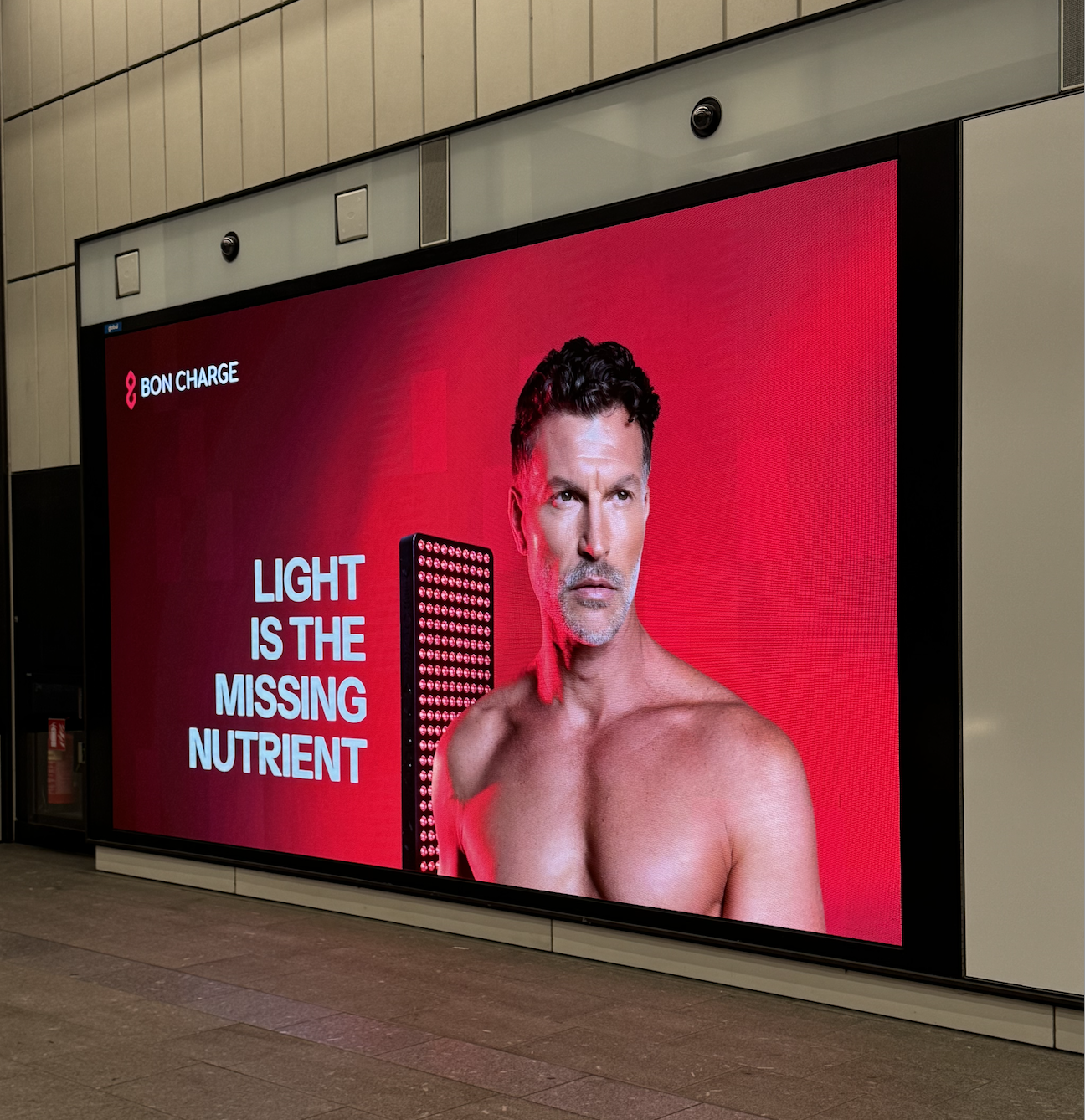
I directed Bon Charge's first major out-of-home campaign across London. The brief was to take a scientific truth that most people have never encountered and make it feel urgent, personal and impossible to ignore.
The line came from the brand's core positioning: that we have engineered light out of our lives and are paying for it with our sleep, our energy, and our health. Bon Charge gives it back.
40
2
50
Bus Routes
Digital Screens
Billboards
Website and Digital
The Brand
at Scale Online
I oversee all creative direction for boncharge.com: homepage art direction, campaign landing pages, email design, and the visual identity of the brand's organic social presence across Instagram and TikTok. The digital ecosystem is where most consumers meet Bon Charge first. It has to earn their attention immediately.
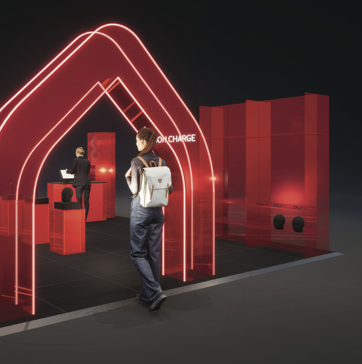
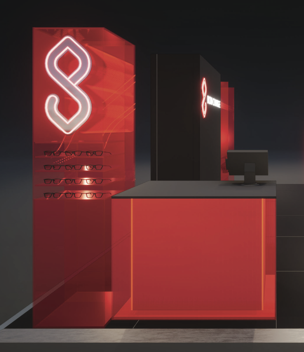
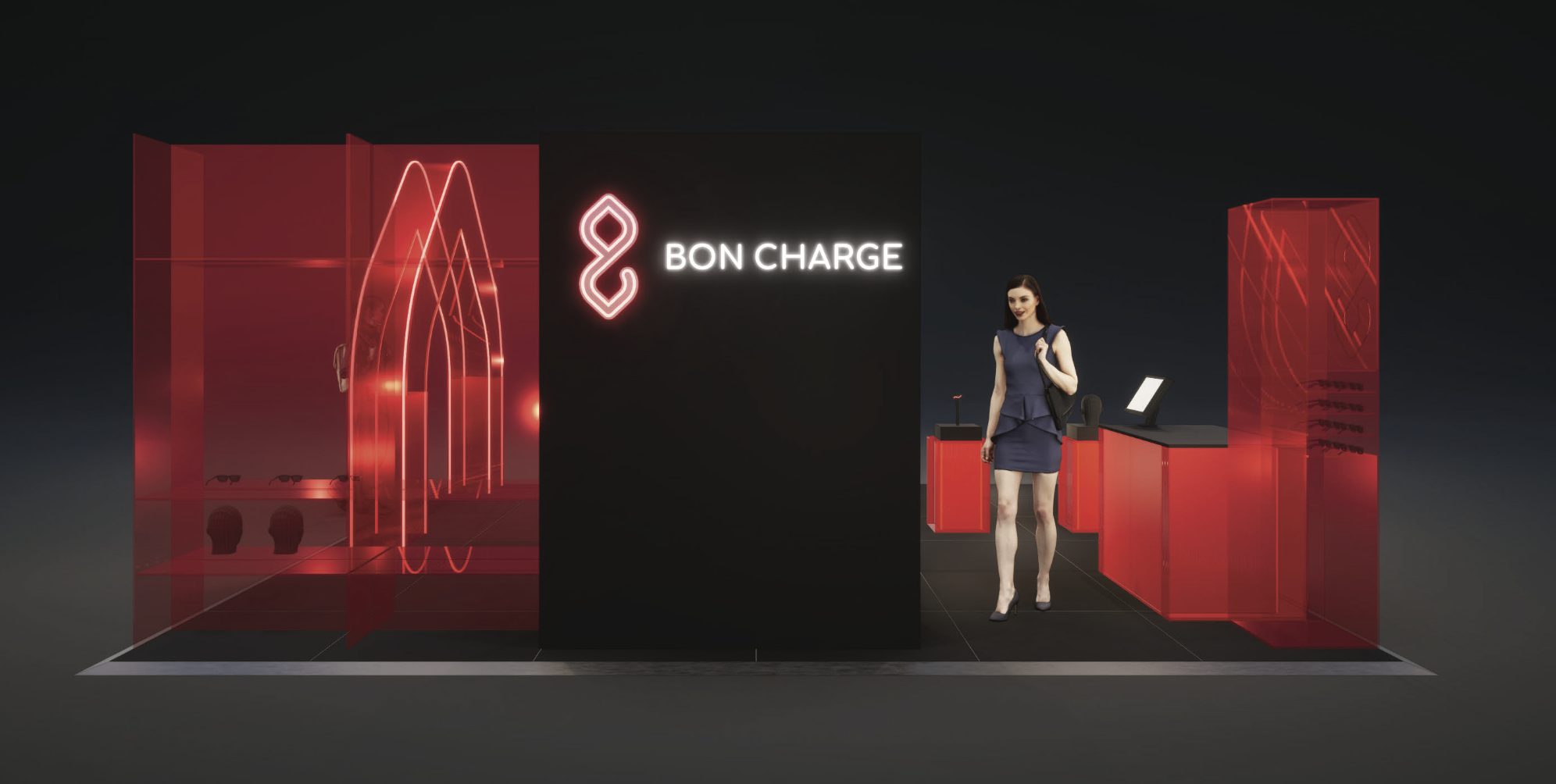
Events and Activations
Bringing the
Brand Into
the Room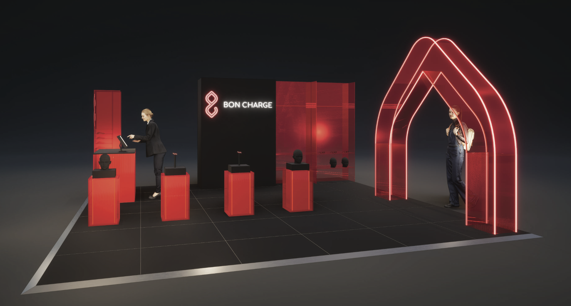
I direct all event and activation creative for Bon Charge: branded environments, event collateral, product experience spaces, and the visual identity of the brand at every live touchpoint.
The challenge with wellness tech at events is the same as at retail: the product has to feel credible, not clinical. The environments I design sit at the intersection of science and lifestyle. People should feel like they have discovered something, not been sold something.
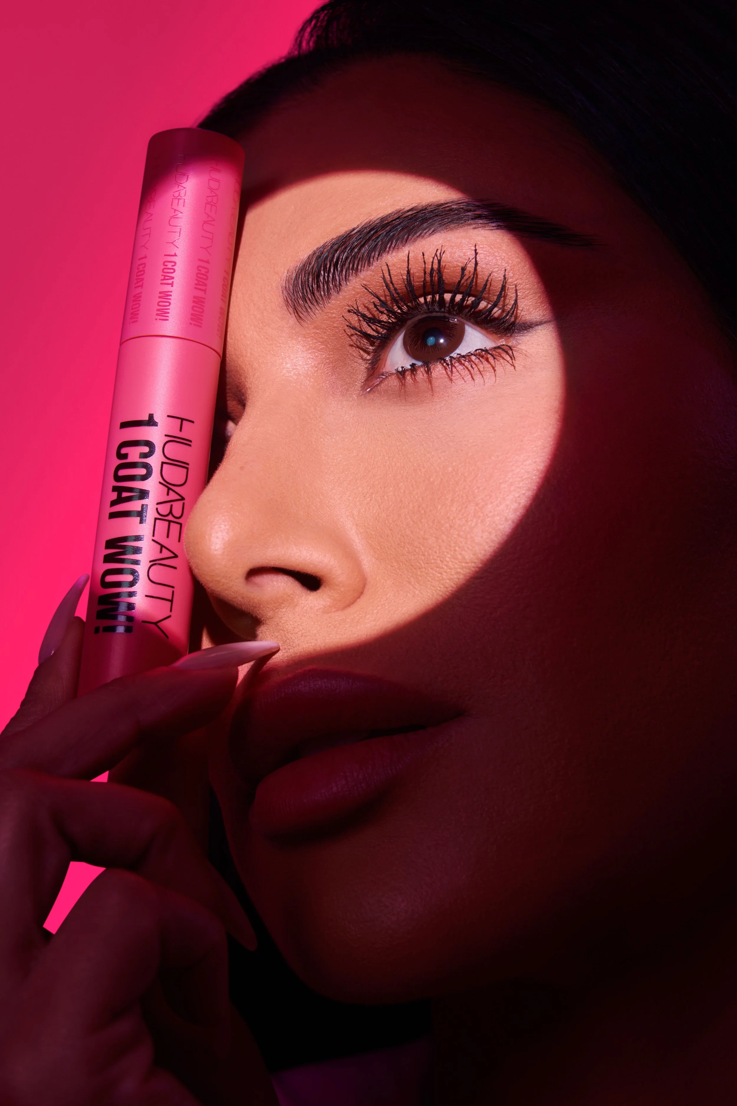
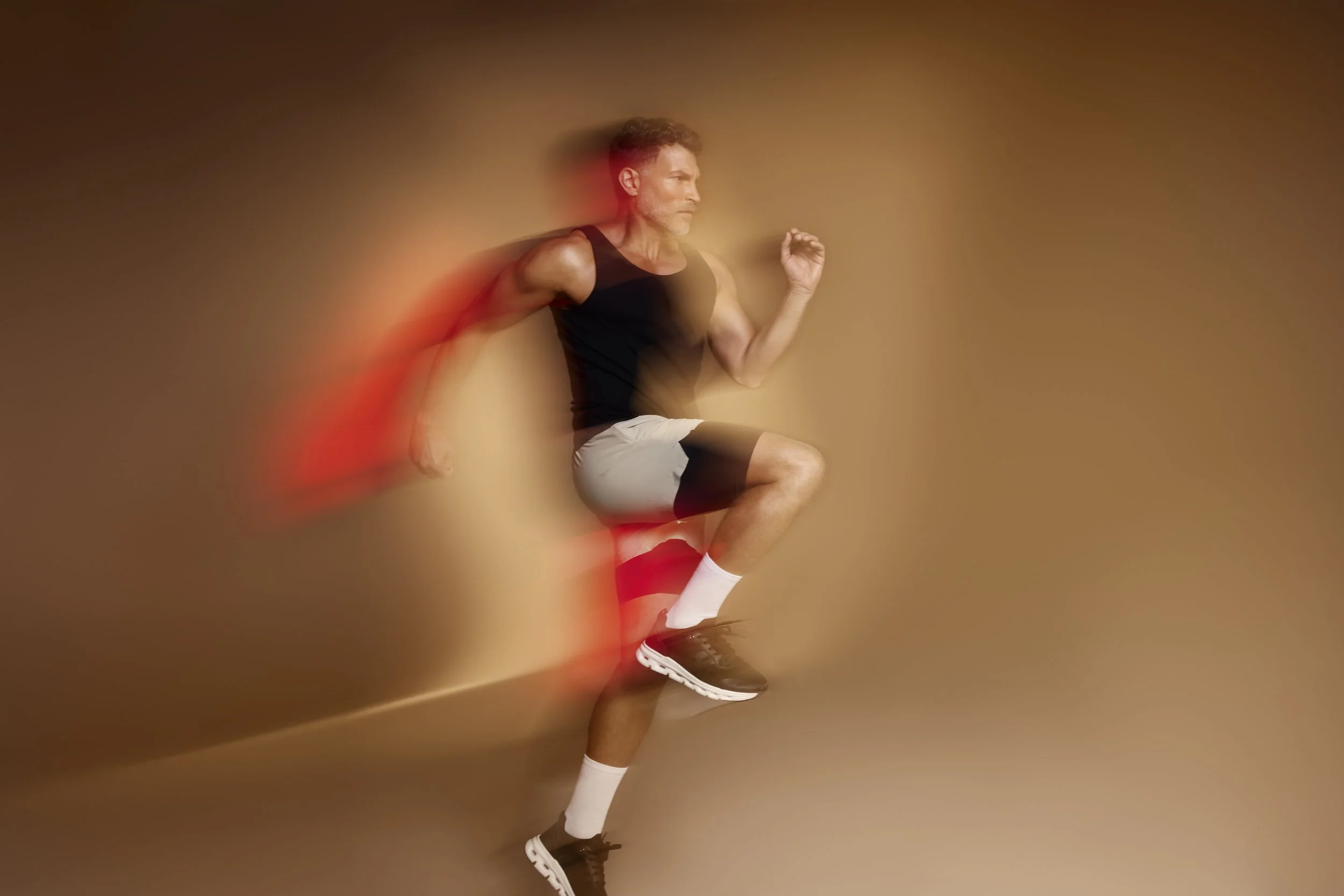
Brand Imagery System
The Bon Charge imagery system spans five distinct territories: brand, environmental, lifestyle, studio and product. Each has its own visual grammar but all carry the same warmth, the same quality of light, and the same sense of a life lived intentionally.


STILL BUILDING
This Brand Has Not Reached Its Ceiling YetThe rebrand was the foundation. Everything since has been about building on it: refining the identity, deepening the content strategy, expanding into new categories and markets. The work is ongoing, the brand is getting stronger, and I am still here doing it.